01.
Logo
Our logo is the simplest way to signal who we are—use it with care and consistency. Always preserve its proportions, give it breathing room, and prioritize legibility over decoration. When in doubt, choose the cleanest placement with the strongest contrast.
Brand Icon
Use the brand icon when space is tight or a full logo would feel heavy—favicons, app icons, social avatars, and small UI touchpoints where quick recognition matters.
Minimum Size
50px
Clear Space
40%
02.
Color
Color sets the tone before a single word is read. Our palette is built to feel confident, modern, and clear—supporting strong hierarchy and accessible contrast. Use core colors for structure and recognition, and apply accent colors intentionally to guide attention.
03.
Typography
Typography is where clarity becomes craft. Our type system is designed for calm readability, strong hierarchy, and a direct voice. Keep layouts simple, use consistent scales, and let spacing do the heavy lifting.
Primary Font Family
DM Sans
Alt Font Family
Geist Mono
Hero
Use for the single, biggest statement on a page—the boldest headline or primary message.
Size
10rem
Line-Height
1em
Letter-Spacing
-0.05em
Our Work
Display
Use for section-leading headlines that set the theme and pull attention without taking over the page.
Size
4.5rem
Line-Height
1.1em
Letter-Spacing
-0.05em
Your full-service software development partner
H1
Use for major sections to establish top-level hierarchy.
Size
3.7rem
Line-Height
1.1em
Letter-Spacing
-0.04em
Ready for Software that fits your business?
h2
Use for secondary section titles that live under an H1 and break content into clear, scannable chunks.
Size
3.7rem
Line-Height
1.1em
Letter-Spacing
-0.04em
Our Core Values
Subheading
Use directly under a headline to add context, detail, or a short supporting message.
Size
2.875rem
Line-Height
1.3em
Letter-Spacing
-0.03em
Let's get the conversation started.
Body
Use for the main readable text—paragraphs, descriptions, and anything meant to be scanned and understood quickly
Size
1.6rem
Line-Height
1.6em
Letter-Spacing
-0.02em
Whether you work in construction, manufacturing, healthcare, or finance, investing in custom software can streamline your workflow, eliminate errors, and increase team productivity.
Mono Caps
Use for section headings and call-outs in asides and secondary content.
Size
1.05rem
Line-Height
1.2em
Letter-Spacing
0
RoleModel Company Highlights
Aa
04.
Voice
Our tone of voice embodies our brand’s personality, built on trust, collaboration, and expertise. We aim to be approachably professional—conversational and friendly.
Intentional
Every line has a job. We don’t fill space — we move things forward.
Purpose
Say the point early
Structure
One idea at a time
Next step
Make the ask clear
Your business is our focus through every phase of your project.
Professional
Concise when it helps. Clear in any context.
Clarity
Plain language first
Confidence
Certain, not arrogant
Precision
Fewer words, better words
We share our experience with you in a partnership to guide you through the custom software development process.
Approachable
We sound human. We don’t posture.
Pace
Short, clear sentences
Word choice
Familiar over fancy
Warmth
Helpful, not salesy
Let’s talk about your project!
Instructive
We teach by showing. We help people make decisions.
Explain
Define terms as needed
Guide
Offer a path, not a lecture
Options
Give tradeoffs + recommendation
Let us guide you through your options.
Engaging
Curious and present. We listen, then respond.
Questions
Ask before assuming
Listening
Reflect understanding
Momentum
Keep it moving
The best software projects don’t start with code—they start with understanding your business, your goals, and how software can help you reach them.
04.
Imagery
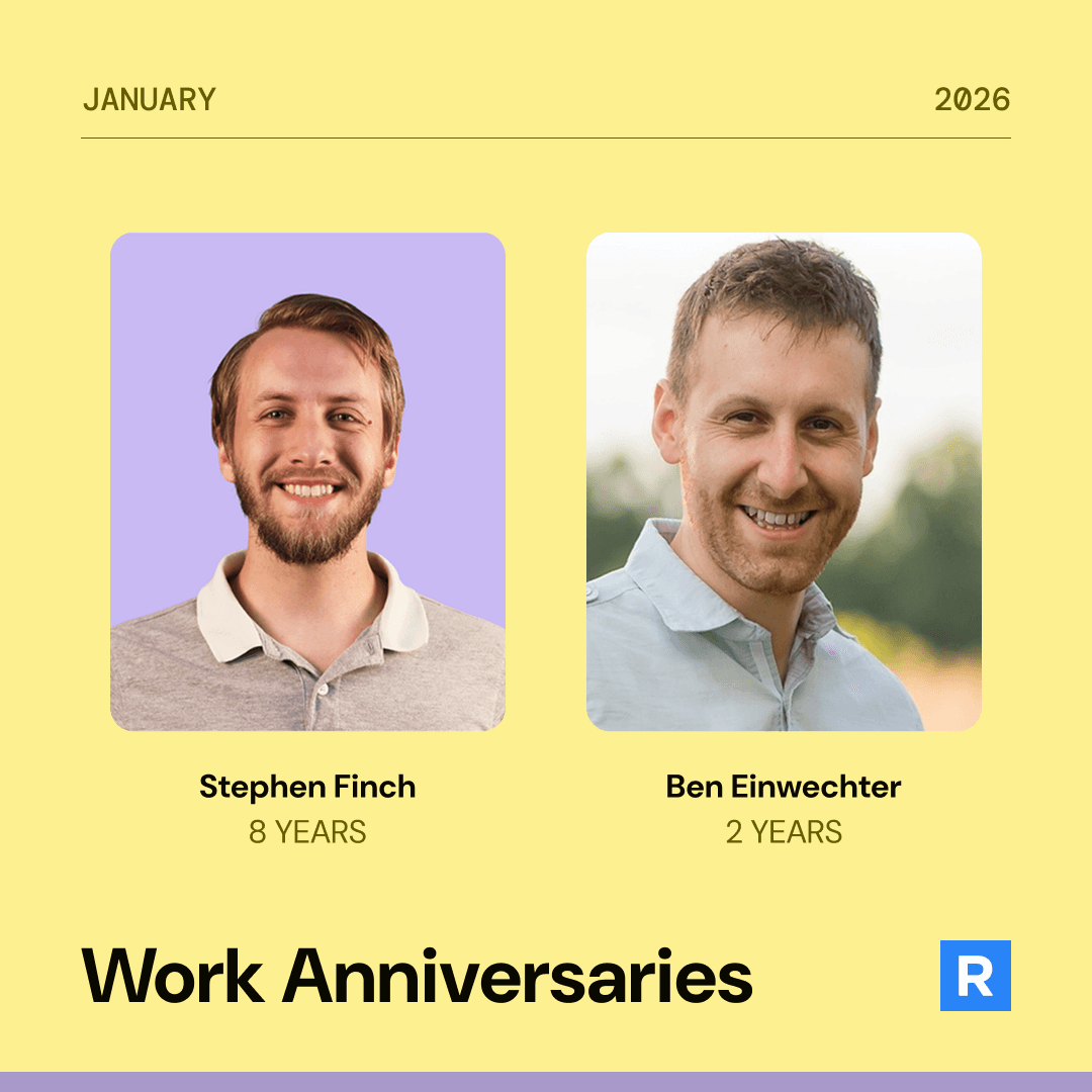
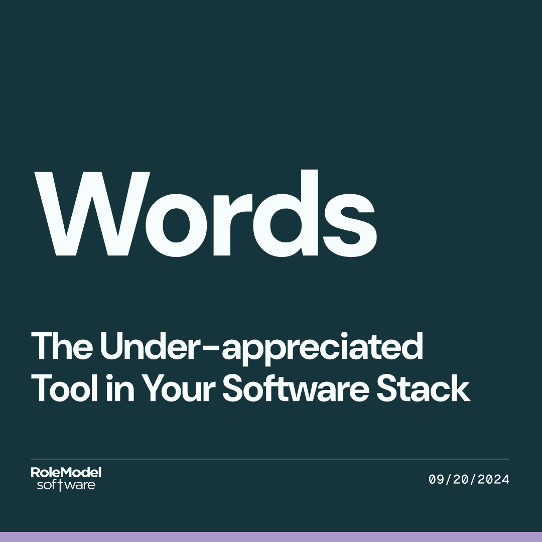
Imagery should feel real, grounded, and people-centered—showing the work, the process, and the partnership. Favor authentic moments over stocky “tech” clichés. Choose photos and illustrations that reinforce trust, competence, and momentum.
05.
Icons
Icons help us recognize complex ideas instantly.
Spot Icons
Use these as bold, illustrative accents to introduce a section or reinforce a concept, usually at larger sizes. They are minimal and purposeful so they don’t compete with the headline.
Icon Set
Pictograms
Pictograms are simple, symbolic visuals used to explain a concept or process at a glance. Use them in brand moments like feature explanations, steps, and storytelling sections, and avoid using them for interface controls.
Icon Set
UI Icons
Use these to support interaction—navigation, actions, and status—at small sizes with consistent stroke and alignment. They should improve scanning and usability, not draw attention to themselves.
Icon Set
07.
Visual Style
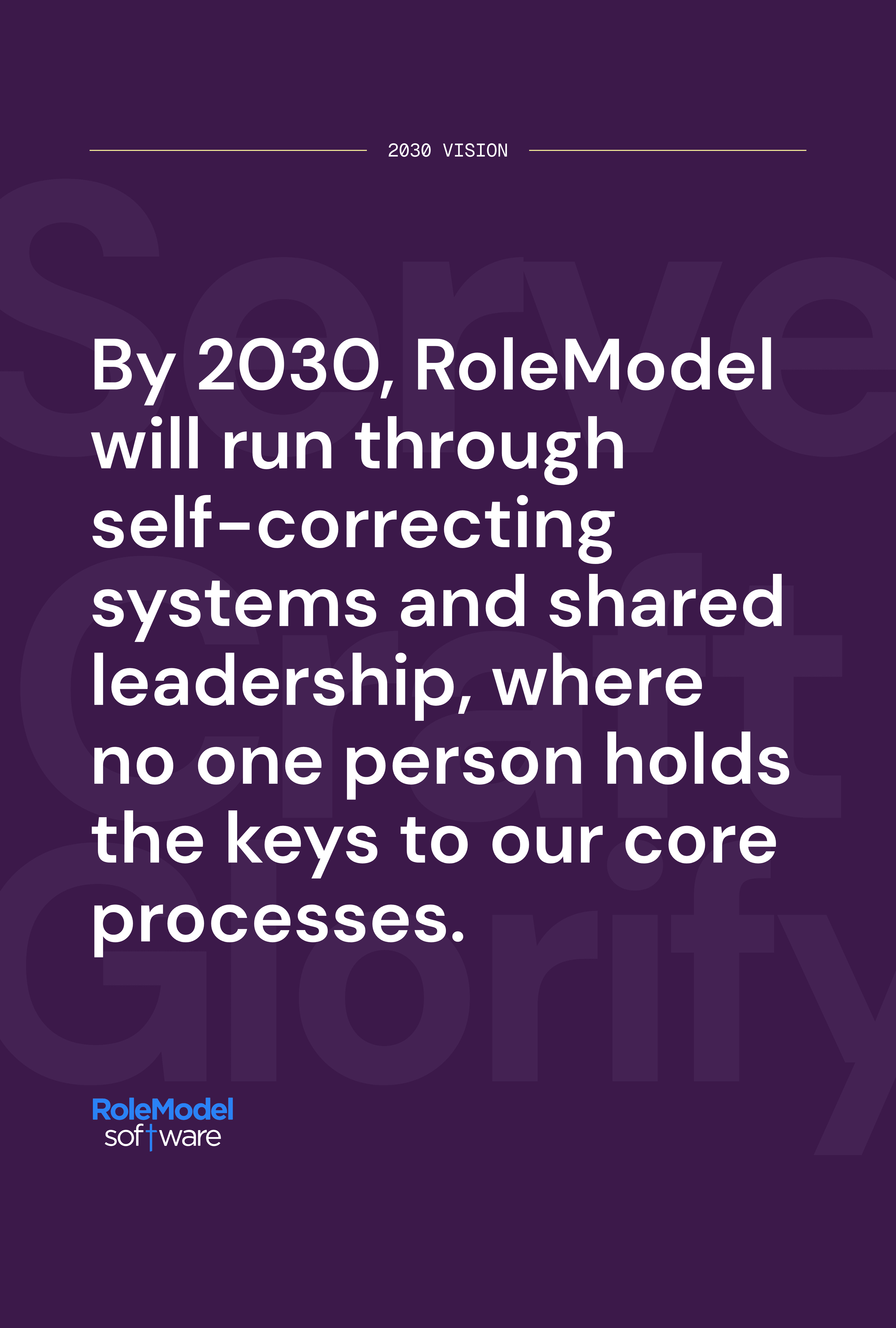
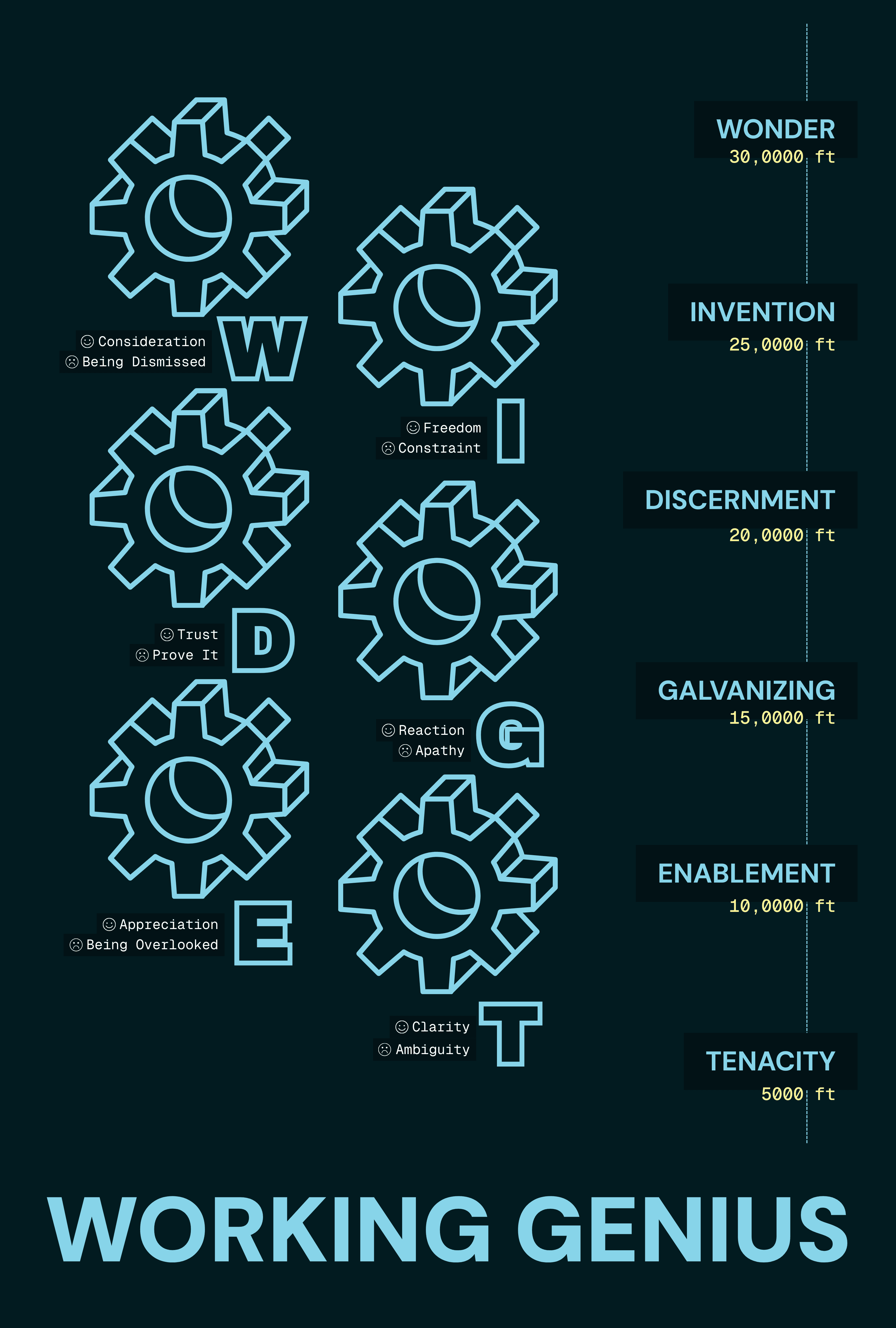
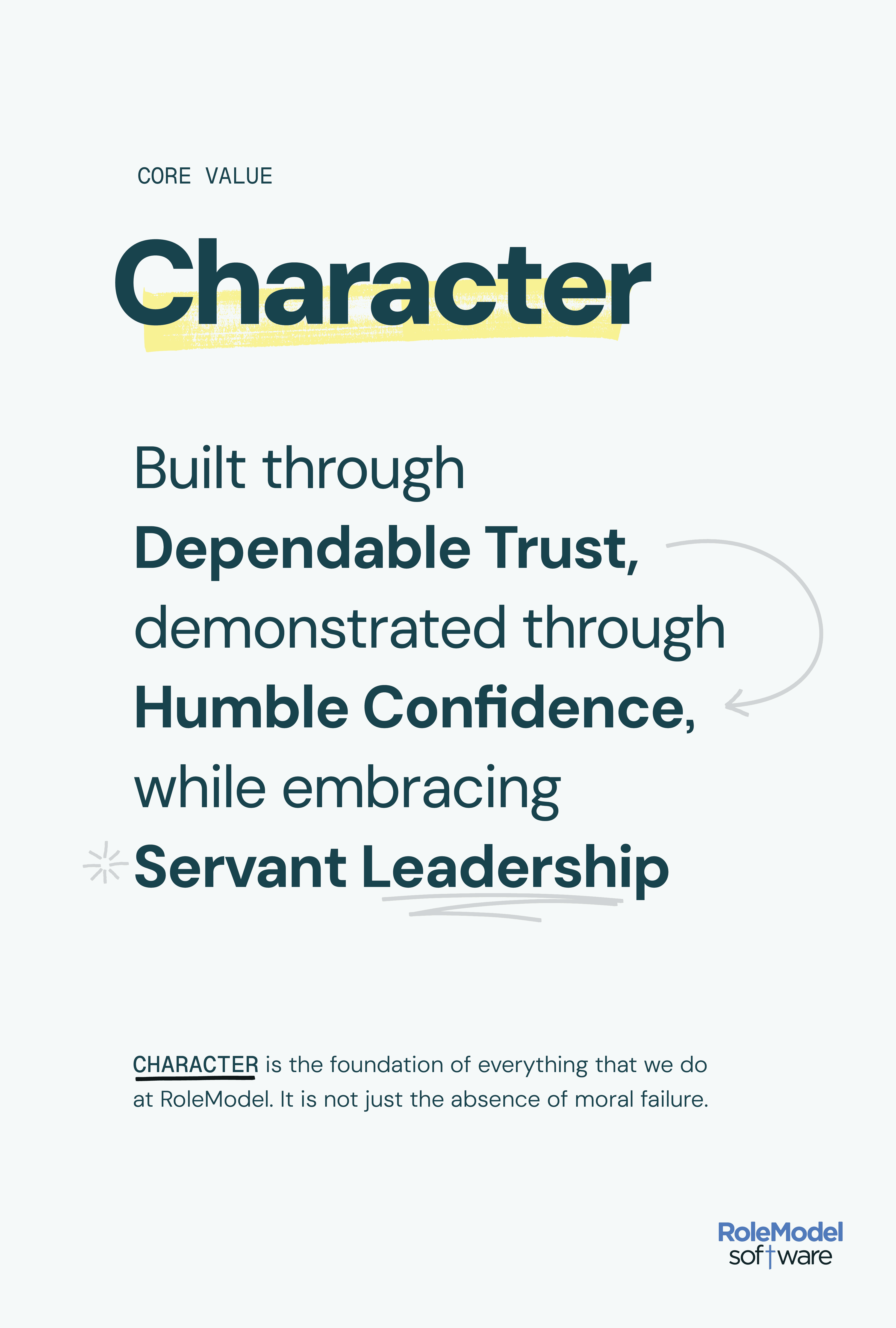
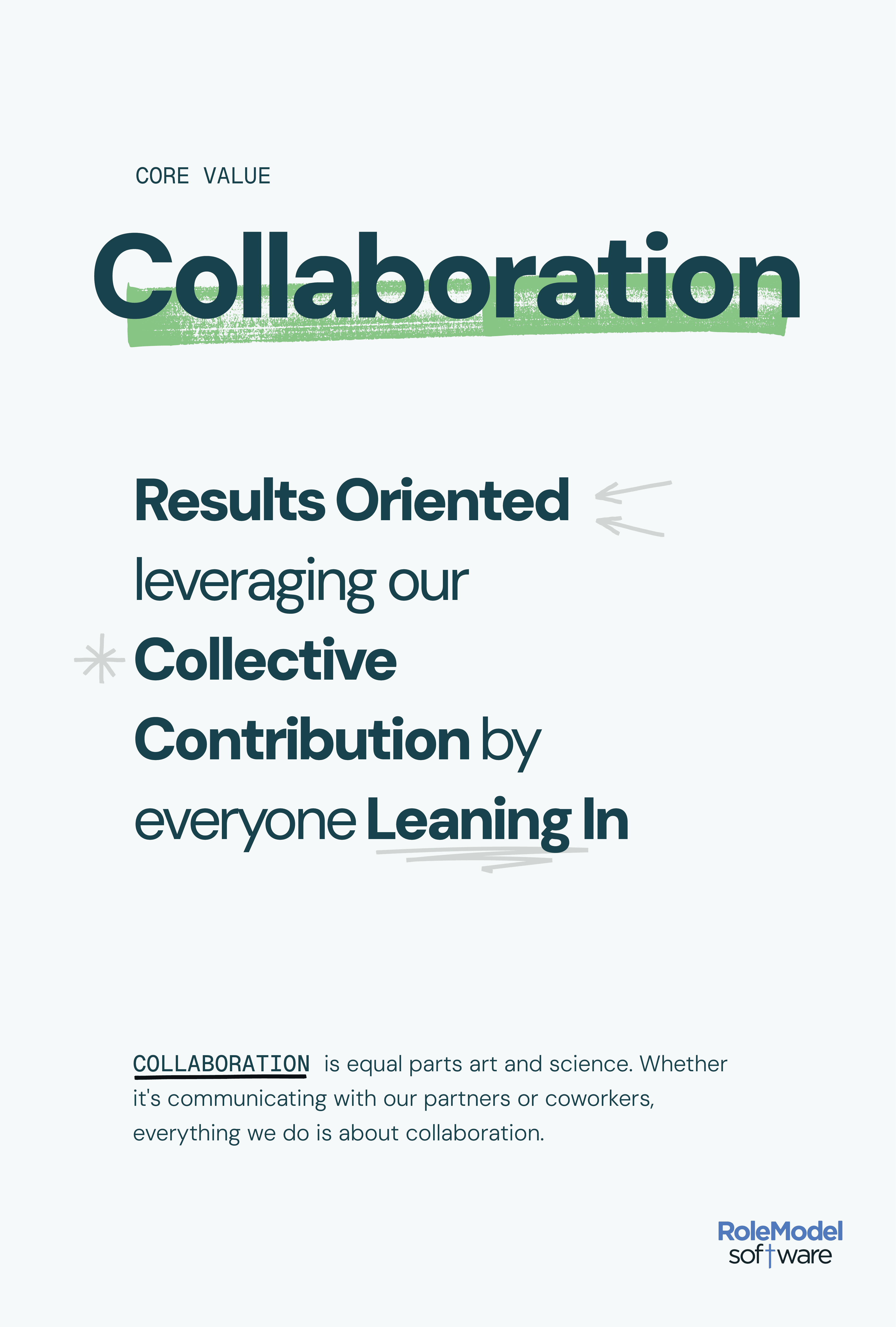
Our visual style is confident and modern, with color used as a first-class design element—bold when it needs to be, controlled everywhere else. We lean on strong grids, generous spacing, and clear hierarchy so the palette feels intentional, not noisy. Color carries meaning and energy, while layout keeps things grounded.


